What I learned by trying my own “XS” tickets
December 15, 2025
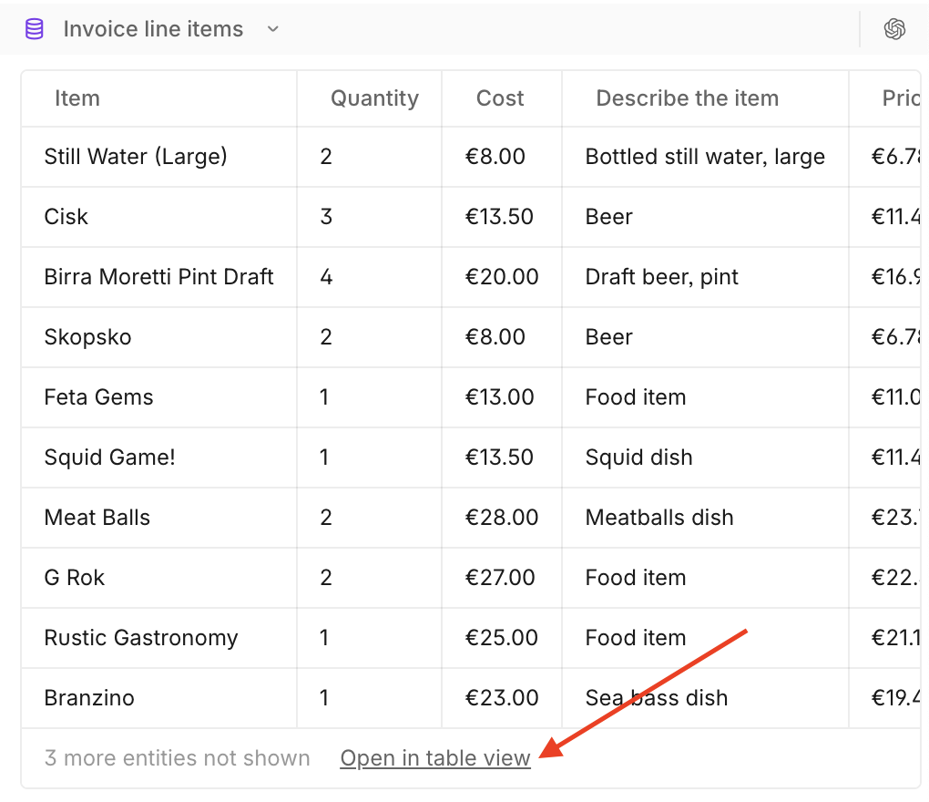
I often find little UI/UX tweaks I want to make in our product. I see a user struggle to find functionality, which makes me want to create an easier entry point. These are supposedly small things I try to fit around our existing priorities without eating into our valuable design time. It’s not uncommon for me to write two lines in a Linear ticket, accompanied by a screenshot with a red arrow “add a button here”, I mentally pop in an XS estimate, and see if someone can pick it up.
Most often the result of this is a PR with an attached video where the engineer is walking everyone through “the why” and then subsequently the solution.
You know what? It’s not uncommon that the button is not where the screenshot had suggested.
Often it is somewhere better, more thoughtful, perfectly aligned to our design system, and successfully achieves the end goal. What you don’t see in the video are the invisible steps that were taken to land on that solution, or the reasons why the suggested “arrow position” never would have worked.
In some cases, it’s not possible to go from two sentences straight to a better solution. Too many things haven’t been thought through (by me), and this results in a disjointed back and forth discussion where we have to “adjust this”, and “change that”. Multiple unhappy paths reveal themselves, and after a disproportionate number of Slack messages and definitely more than an XS amount of time, the “XS” change doesn’t feel like it was worth the cost.
My company heavily encourages us to experiment with AI and evolve our practice, so with the encouragement of my team and tools like Cursor I decided to try out one of my “XS” tickets for myself. I thought it would be a fun activity, and I could tick off one of the many delightful small improvements we want for our customers at the same time.
I started by adding an “Open in table view” button to take users to the expanded state of a table. I could see the vision in my mind, the functionality existed. I’ll just put a hyperlink “Click here to jump to the full table”. In two prompts it was done! But it looked wrong. I realized we don’t use hyperlinks in our product.
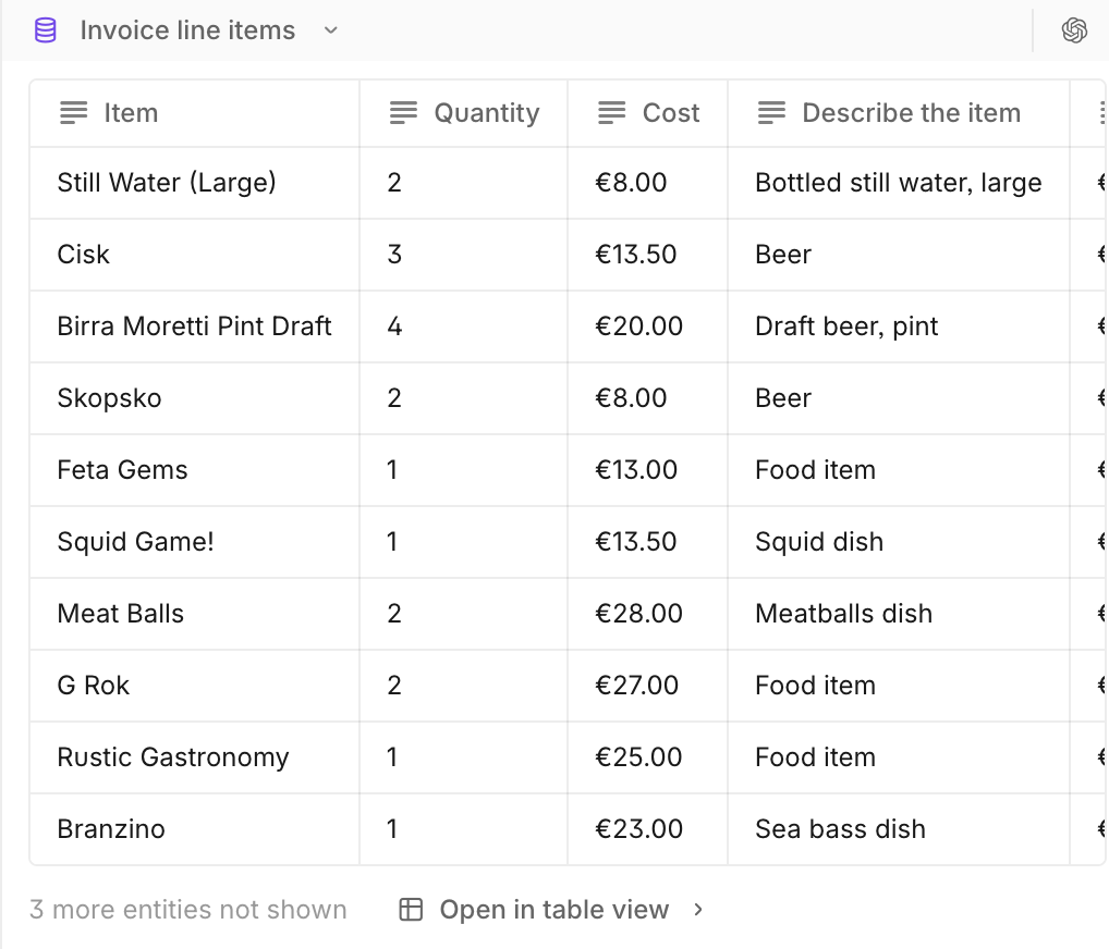
No worries - we already have a similar button that does this elsewhere. I'll put it in the final row of the table. Two prompts later, the adjustment was made. I tried it out, visually it was more aligned with our product, but when I looked at real data I remembered that the tables have a horizontal scroll, and the button went off screen if there were many columns.
I decided to make the button position relative to the viewport. That looked ridiculous - no further comment…
In that moment I saw all of the journey from “red arrow” to perfect placement. All the hidden exploration and user empathy that our engineers were doing in between the lines of these “XS” tickets. In the end, I handed over the ticket to one of our excellent product engineers with all the context, and we ended up with this.
The thing with these small UI/UX tweaks is that the obvious solution (an arrow in a screenshot) is not always the best one. For simple interactions, two lines explaining the user impact is often enough context to bridge that gap, and enable that thinking to be delegated to the engineers (thanks!!), but my learnings on this journey have very little to do with these simpler tickets.
It instead made me think more about the more complex changes, where we often end up in back and forth discussions about unexpected interactions. Where real product data has an outsized impact on the UX, and static wireframes are expensive and struggle to capture the breadth of potential cases. I wondered if POCs developed within our product & design team would be a more effective way to handover these types of changes, and that the result would be a more considered user experience overall.
If a picture is worth a thousand words, then maybe a functioning POC is worth 10-fold.
We got to test this out, when we implemented a visual overhaul for our Cases feature. Instead of writing lots of tickets, or investing in hi-fi designs, we shared a Loom and a POC/branch which had these changes implemented.
The result was only two clarifying questions from the engineer, and all of the changes released to customers in 3 days. The reality is you are 10x more likely to find and resolve the unhappy paths when you test your change in product, and a POC + Loom is a much more efficient way to handover micro-interactions.
Now that the cost of entry is lower, testing your ideas in product is completely achievable, and I’ve been excited to see this way of working spreading with our designers also testing this as a method to handover their intended flows.
So is this to say all my experiments pay off? It’s a mixed bag. Some of them become a PR, some of them are used for handovers, and some of them I share in our ideation channel. The remainder, well, they go straight in the trash - never to be seen by others (that was not a good idea).
And as for those “XS” tickets, do I still make them from time to time? Of course! Our product engineers were already solving that gap, but at least I am now 10x more appreciative when I see they’ve had to adjust the solution to help our customers have the best experience.